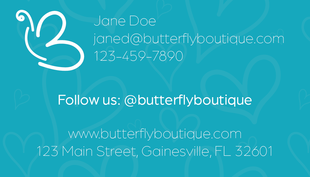
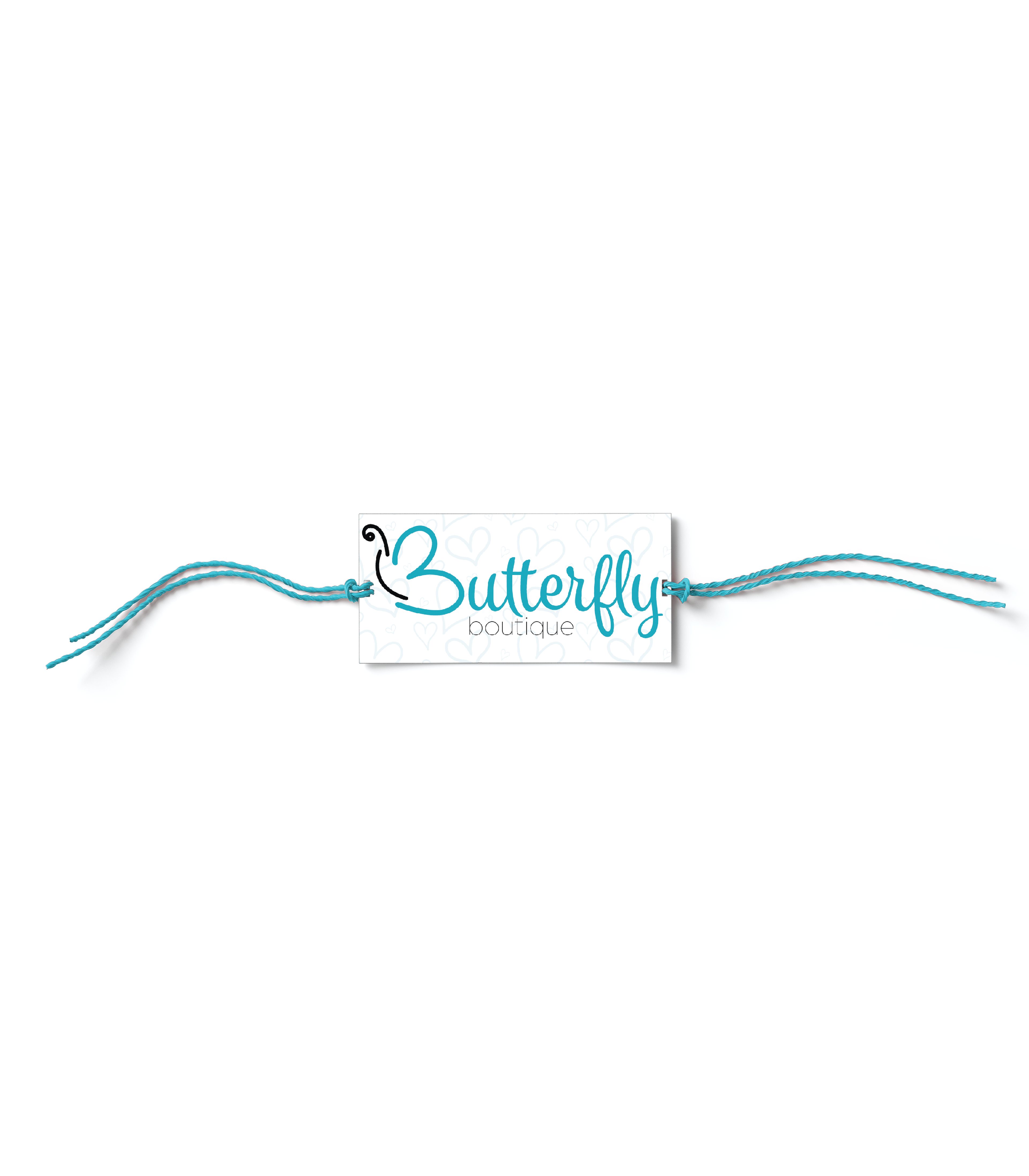
I was tasked with designing a letter-based logo for an imagined second-hand boutique located in Gainesville, featuring an outdoor butterfly garden: Butterfly Boutique. I designed the logo as a combination of the letter 'b' to emphasize the alliteration of the boutique’s name, and a butterfly to emphasize the beauty and refinement of the business’ products while highlighting their secondary function as a butterfly garden. I was inspired by typefaces employed by similar businesses around Gainesville and digitally sketched a variety of potential logos. I vectorized the sketches with a minimalist approach to illustrate the modernity of the boutique and appeal to a college-aged audience commonly interested in contemporary aesthetics.
The choice to use a minimalistic style proved to be one of the most challenging aspects of this project because of the delicate balance between the simplicity of the icon and the readability of the letter. I designed the letterform using three distinct lines that build the parts of the butterfly. The wings of the butterfly create the bowls of the letter, the body functions as the stem, and the antenna illustrates the apex. The script typeface complements the brandmark because of the association of boutiques with elegance and the light blue color palette conveys a sense of grace and loyalty due to the color signifying trust and serenity.